Bunifu Toggle Switch
Overview
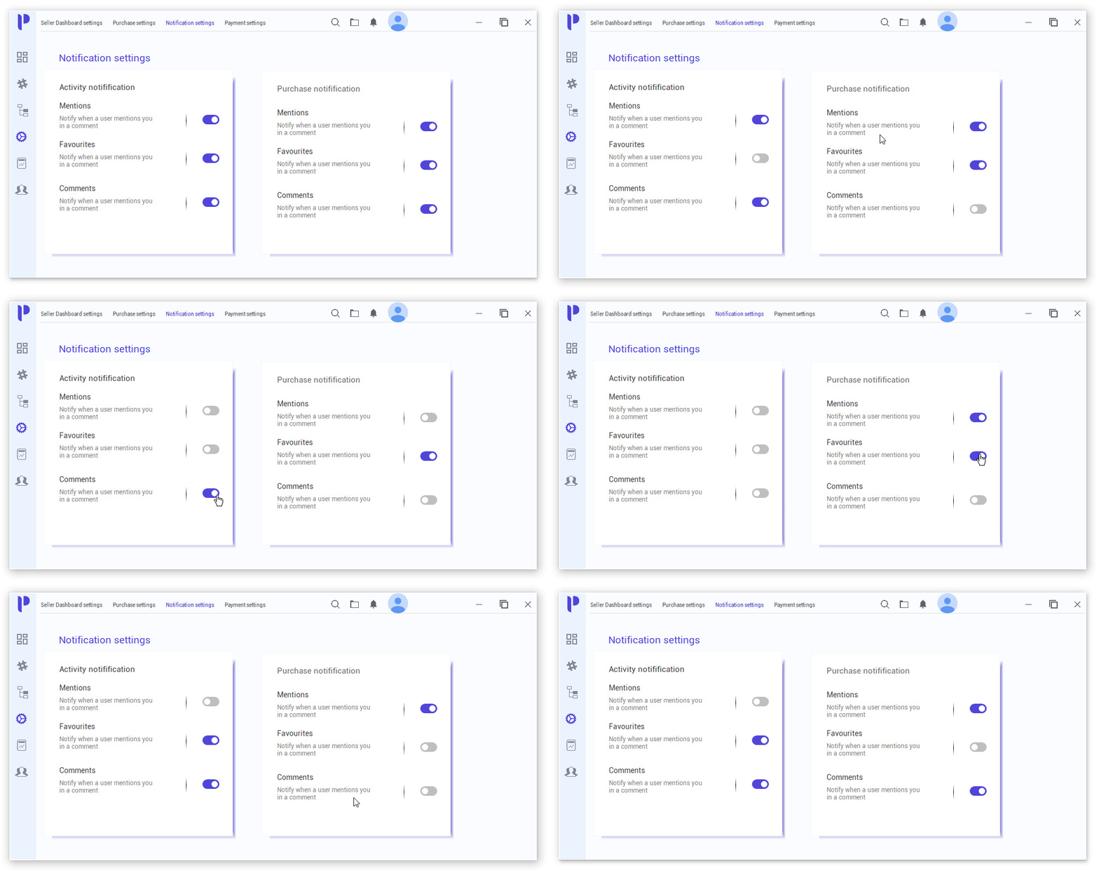
Bunifu Toggle Switch Button control is a rich two-state button, perfect for when you need to provide the user with an option to flip a switch. It has highly customizable toggle settings and features such as animations that will blend into the look and feel of your WinForms application.
Getting Started
This section describes how to include Bunifu Toggle Switches in both the design and coding environments.
Adding Bunifu Toggle Switch at design time
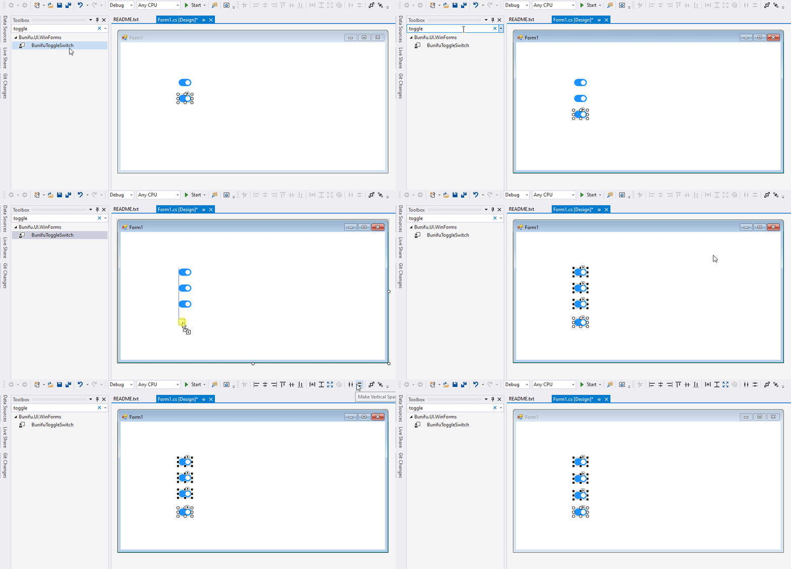
Bunifu Toggle Switch can be added to the form by simply locating or searching BunifuToggleSwitch control in your toolbox and dragging it onto your form. You can then customize using the custom properties provided. We'll discuss the various features in greater detail later in this documentation.
Adding Bunifu Toggle Switch at Runtime
To add Bunifu Toggle Switch at runtime we will have to use the Form's Load event handler, where we'll create an instance of BunifuToggleSwitch control and add it to the form as shown below.:
- C#
- VB.NET
private void Form1_Load(object sender, EventArgs e)
{
    //Instatiate Bunifu Toggle Switch control using Bunifu.UI.WinForms
    BunifuToggleSwitch toggleSwitch = new BunifuToggleSwitch();
    //Set the location for the toggle switch
    toggleSwitch.Location = new Point(330, 170);
    //set the thumb color for the switch on toggle state on
    toggleSwitch.ToggleStateOn.BackColorInner = Color.White;
    //set the back color for the switch on toggle state on
    toggleSwitch.ToggleStateOn.BackColor = Color.DodgerBlue;
    //add the toggle switch to the form
    this.Controls.Add(toggleSwitch);
}
Private Sub Form1_Load(ByVal sender As Object, ByVal e As EventArgs)
	'Instatiate Bunifu Toggle Switch control using Bunifu.UI.WinForms
	Dim toggleSwitch As New BunifuToggleSwitch()
	'Set the location for the toggle switch
	toggleSwitch.Location = New Point(330, 170)
	'set the thumb color for the switch on toggle state on
	toggleSwitch.ToggleStateOn.BackColorInner = Color.White
	'set the back color for the switch on toggle state on
	toggleSwitch.ToggleStateOn.BackColor = Color.DodgerBlue
	'add the toggle switch to the form
	Me.Controls.Add(toggleSwitch)
End Sub
Let's deep dive and get insights into the available properties on Bunifu Toggle Switch.
Animation
This property makes sliding and a bounce effect to the switch when switching states. It sets a numeric value that sets the animation speed.
Checked
This property sets a boolean value, which determines the toggle state of the control. When the property is set to true, it sets the toggle switch in an On state.
The property is used in conjuction with the CheckedChanged event which fires whenever the toggle state changes. Here's a code snippet that displays a snackbar whenever the state changes
- C#
- VB.NET
private void bunifuToggleSwitch1_CheckedChanged(object sender, Bunifu.UI.WinForms.BunifuToggleSwitch.CheckedChangedEventArgs e)
{
    if (e.Checked)
    {
        bunifuSnackbar1.Show(this, "Option set to On!");
    }
    else
    {
        bunifuSnackbar1.Show(this, "Option set to Off!");
    }
}
Private Sub bunifuToggleSwitch1_CheckedChanged(ByVal sender As Object, ByVal e As Bunifu.UI.WinForms.BunifuToggleSwitch.CheckedChangedEventArgs)
	If e.Checked Then
		bunifuSnackbar1.Show(Me, "Option set to On!")
	Else
		bunifuSnackbar1.Show(Me, "Option set to Off!")
	End If
End Sub
ThumbMargin
This property sets a padding value for the thumb or switch, determining the space between the thumb and the toggle switch box border. By default, the value is set to 3.
ToggleStateOn Properties
The on-state properties can be easily accessed under the ToggleStateOn category in the properties pane.
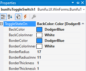
Here's a detailed description of the properties:
1. BackColor
This property allows you to get or set the background color of the toggle switch box. It's compatible with the use of RGB and HEX color values.
2. BackColorInner
This property allows you to get or set the background color of the switch.
3. BorderColor
This property allows you to get or set the toggle switch box border color.
4. BorderColorInner
This property allows you to set the border color of the switch.
5. BorderRadius
This property allows you to apply the radius value for the toggle switch box border edges. By increasing the value, the edges become more rounded.
6. BorderRadiusInner
This property allows you to apply the radius value for the switch edges. By increasing the value, the edges become more rounded.
7. BorderThickness
This property allows you to set a thickness value for the toggle switch box border. By increasing the value, the border becomes thicker.
8. BorderThicknessInner
This property allows you to set the thickness value of the switch. By increasing the value, the border becomes thicker.
ToggleStateOff Properties
The off-state properties can be easily accessed under the ToggleStateOff category in the properties pane.
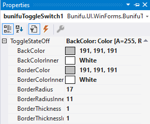
Here's a detailed description of the properties:
1. BackColor
This property allows you to get or set the background color of the toggle switch box. It's compatible with the use of RGB and HEX color values.
2. BackColorInner
This property allows you to get or set the background color of the switch.
3. BorderColor
This property allows you to get or set the toggle switch box border color.
4. BorderColorInner
This property allows you to set the border color of the switch.
5. BorderRadius
This property allows you to apply the radius value for the toggle switch box border edges. By increasing the value, the edges become more rounded.
6. BorderRadiusInner
This property allows you to apply the radius value for the switch edges. By increasing the value, the edges become more rounded.
7. BorderThickness
This property allows you to set a thickness value for the toggle switch box border. By increasing the value, the border becomes thicker.
8. BorderThicknessInner
This property allows you to set the thickness value of the switch. By increasing the value, the border becomes thicker.
ToggleStateDisabled
The disabled state properties can be easily accessed under the ToggleStateDisabled category in the properties pane.

Here's a detailed description of the properties:
1. BackColor
This property allows you to get or set the background color of the toggle switch box. It's compatible with the use of RGB and HEX color values.
2. BackColorInner
This property allows you to get or set the background color of the switch.
3. BorderColor
This property allows you to get or set the toggle switch box border color.
4. BorderColorInner
This property allows you to set the border color of the switch.
5. BorderRadius
This property allows you to apply the radius value for the toggle switch box border edges. By increasing the value, the edges become more rounded.
6. BorderRadiusInner
This property allows you to apply the radius value for the switch edges. By increasing the value, the edges become more rounded.
7. BorderThickness
This property allows you to set a thickness value for the toggle switch box border. By increasing the value, the border becomes thicker.
8. BorderThicknessInner
This property allows you to set the thickness value of the switch. By increasing the value, the border becomes thicker.
We hope you will enjoy Bunifu Toggle Switch and that it will help you create better user experience for your users.
Should you have feedback or suggestions please send us via chat on the bottom right corner of the screen.